Redesigning of a workflow management page that is power enough to allows user to view, manage their workflow, and get any necessary details of it efficiently.
Lead designer, User Research
Goals and Objectives
The initial goal of this project was straightforward: to design a clear and intuitive workflow management page that allows user to have following feature sets.
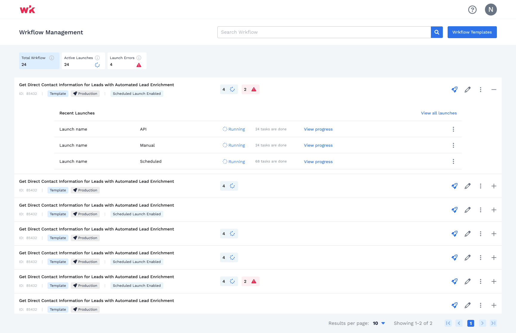
Ability to view all of the Workflow in single page
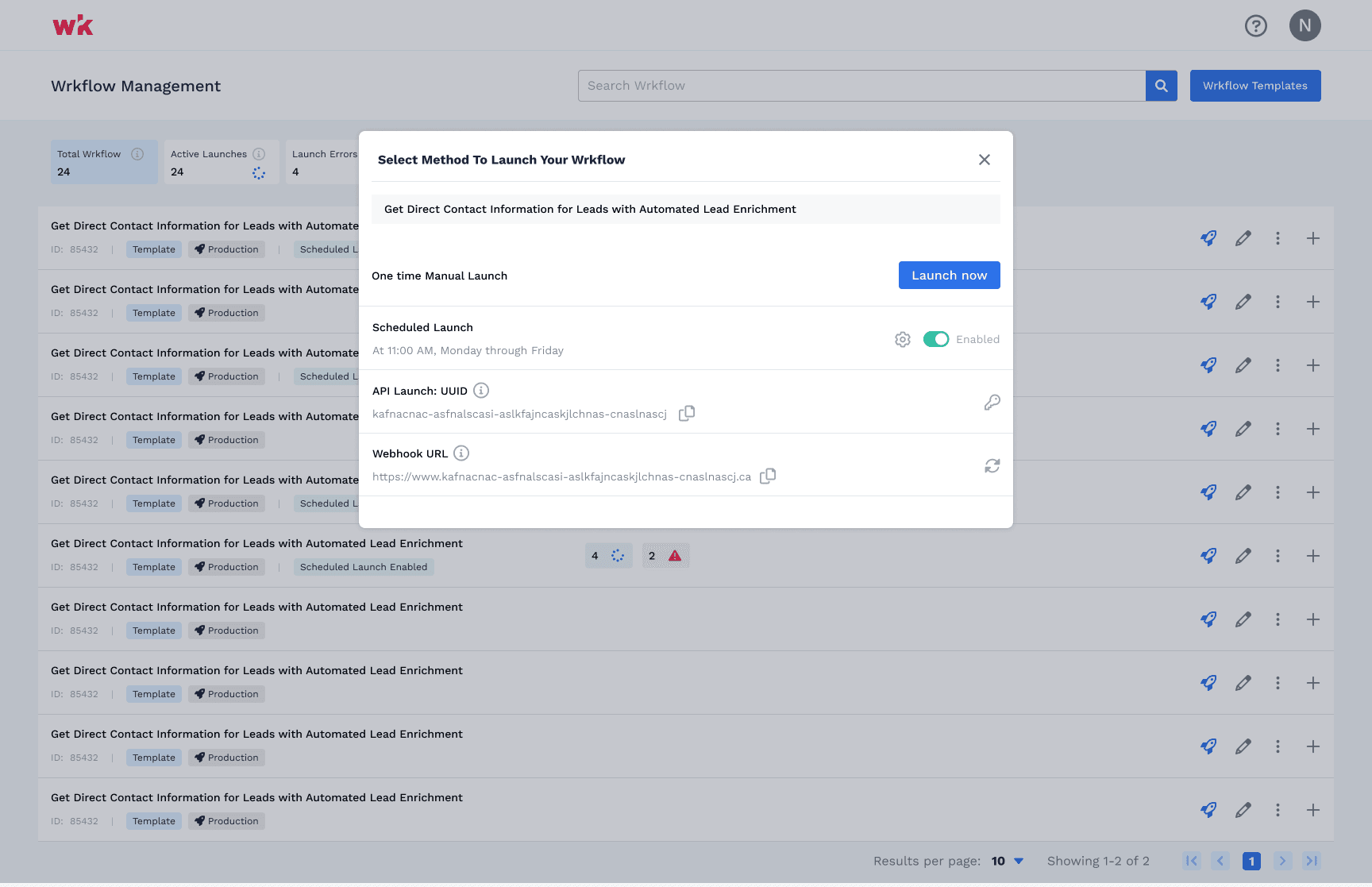
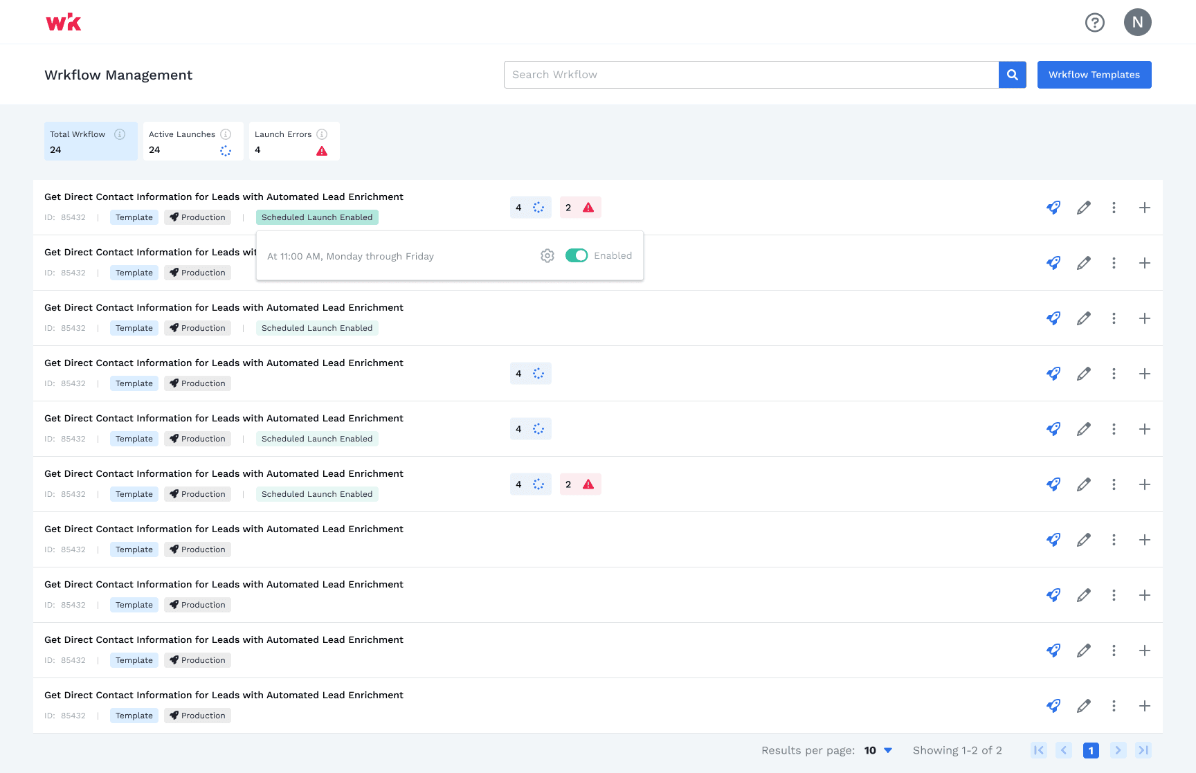
Ability to quickly launch and view errors
Understand the status of each one i.e. active and running vs inactive workflow
Access details like ID and other information in-regards to that workflow as needed.
In short, our objective was to give users full control and transparency over their workflow processes.
First Iteration of the Design
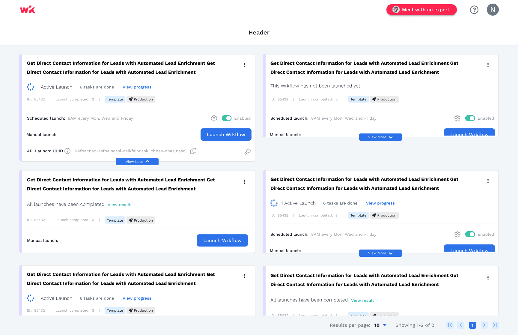
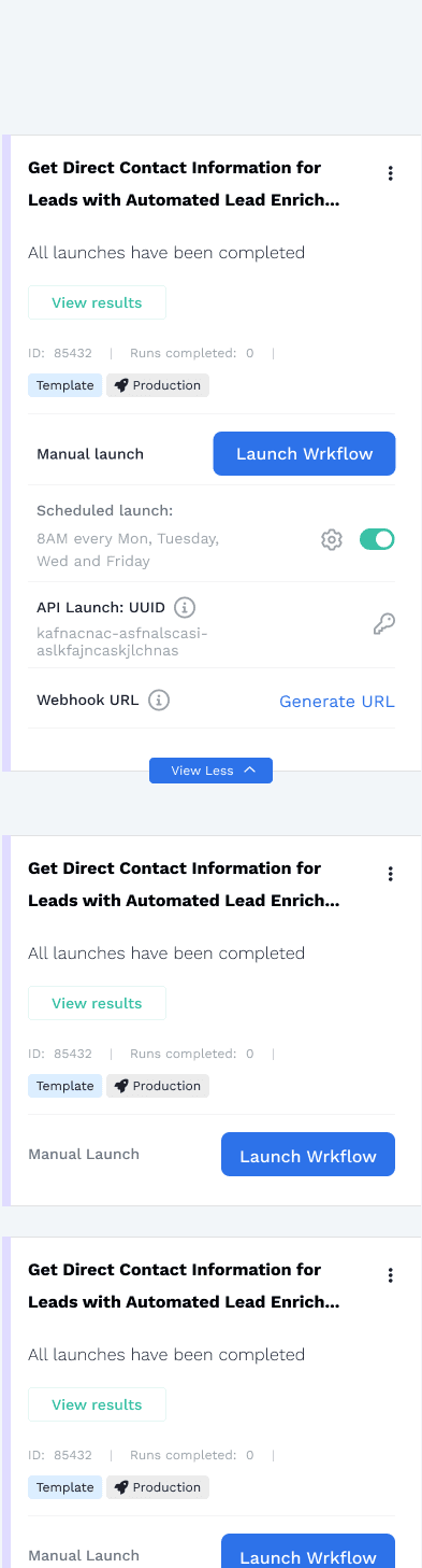
While exploring to different options and layout, we opted for a card-based layout. Cards seemed like a flexible and familiar choice, and they allowed us to present information in a way that felt modern and mobile-friendly. Initially, this worked well. Users could see their workflows, access details, and manage tasks without any friction.
Then we started to add more features and scopes aka Scalability Issues
The feature was successful and user had no trouble using the page. however, as we began to add more features like ability to view API key, web-hook, etc., we started to get the challenges about the use of card and scalability of it. The card layout, while visually appealing, couldn't handle the growing complexity and the need for users to quickly scan multiple workflows with detailed statuses, recent updates, and other key information. We realized that sticking with cards would create more technical debt and limit our ability to scale the design in the long term.
However, due to shortness of time and bandwidth, we went with solutions within the card, which worked great and accepted by the users. however, we know this has to be updated soon.
Revisiting and Redesigning the Solution - Not so easy
Given that we have so much features already being build in the component, changing it will be challenging and time consuming. However, we cannot move forward too far as well, since it will create more challenges and technical debit.
I present the problems to the team and stakeholders. After discussions with stakeholders and the team, we all confirmed that we have to pivot. We wanted it to be power and serve well to our users and with the scalability in mind.
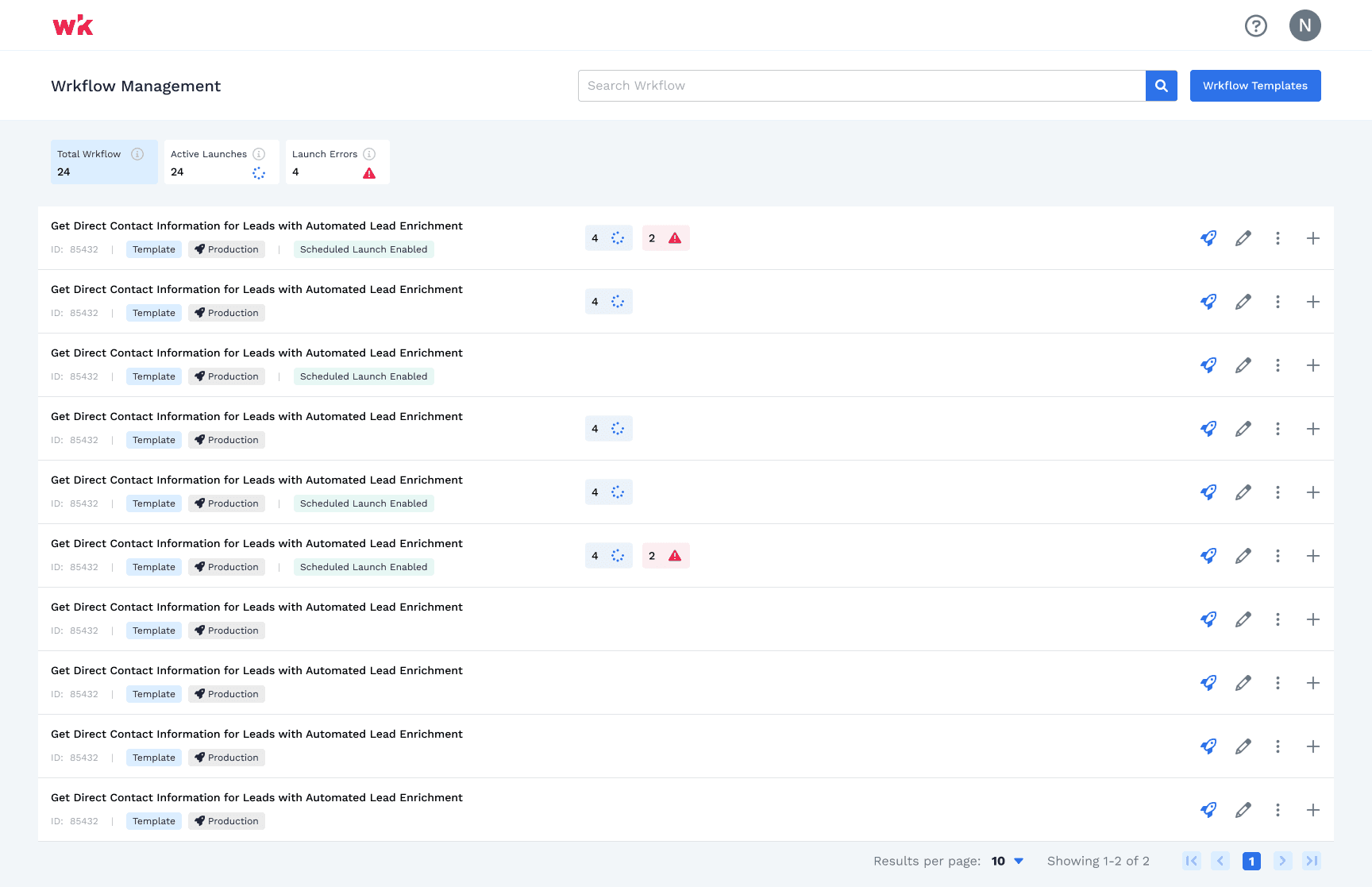
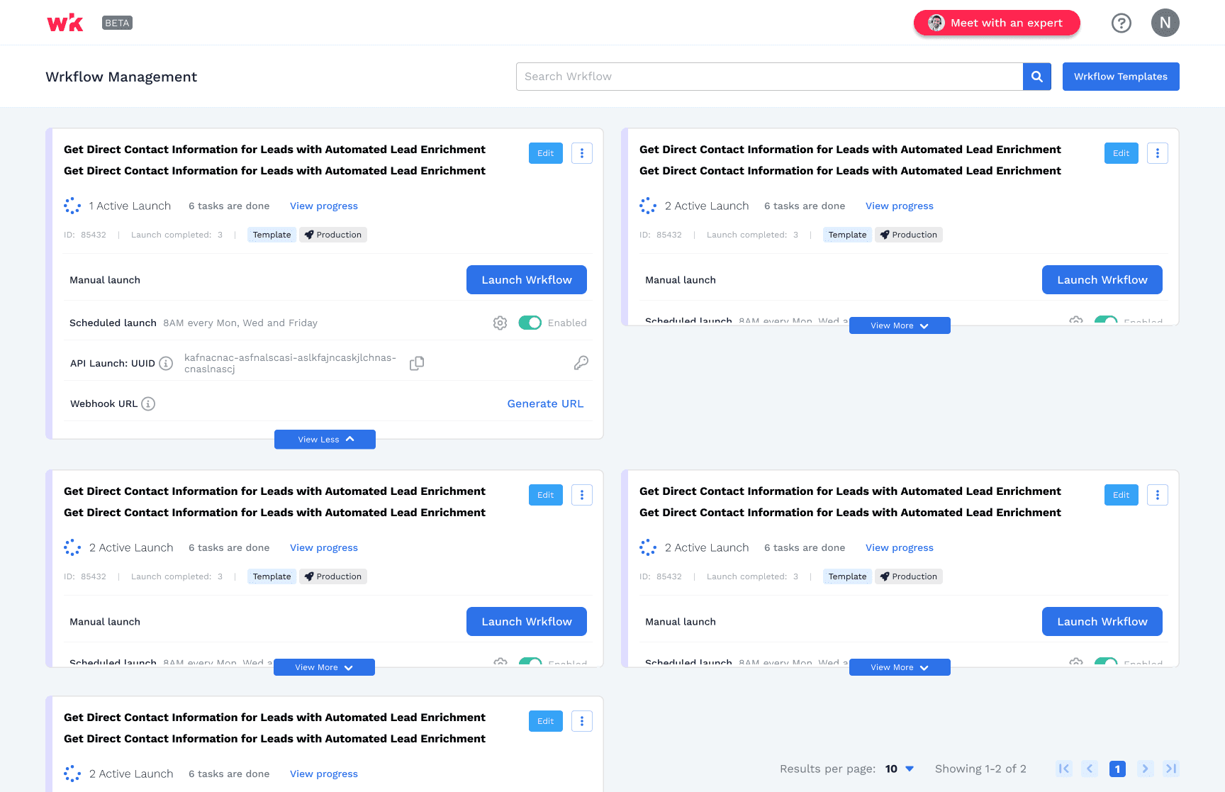
It's was another chance and I have to make it right. Upon researching and brainstorming different solutions, We moved to a table-based design that offered a more powerful and customizable view that has following benefits:
This new layout allowed users to see all the data they needed at a glance
Easily manage multiple workflows
View statuses all efficiently
Ability to view detailed related with the workflow
In the end, this redesign not only solved our scalability issues but was also loved by our stakeholders and end-users alike.